Monday, 13 October 2008

scanning colour film with an Epson Flatbed

IMPORTANT NOTE:


there is an assumption in the blog article below that colour management in the options is set to "no color correction" which is essentially off. I now no longer work this way for reasons you can find elsewhere on my blog, but that is not essential to understand here. No matter what, the principle remains the same -> use Assign profile to assign the profile to your image after scanning.

I have realized that I have not explained this functionality well, but I have discovered a preferable way to mange this.

As I made these discoveries after writing this article (and it was also linked to) I did not wish to delete this blog article, but the points below are relevant when doing some other things (which I personally don't recommend like software plugins called colour neg).

Thus it is essential for you to know exactly what you have set in this settings dialog box as this setting before in the Epson TWAIN driver going further.

I have recently discovered some advantages to using the ICM setting (the second option) and have changed my methods back to this.

So in the following article I discuss the assignment with respect to using No Color Correction.

If you use option 2 "ICM" then after you scan into Photoshop you have to assign profile as per what ever the target is in that dialog box (in this case it is Epson ColorMatch RGb). If you were using some of the calibration target systems such asIT8 you would use that, I don't.

I have found that using ICM settings enables some important features:
  1. activation of the Epsons internal calibration systems and allows you to influence how effective scan depth of dark regions of the film by setting sliders in the histogram control.
  2. not activating continuous adaptation to each section you select for scanning. Please see my article on that.

I think that if you wish to be using the option 1 that the correct profile to assign for the Epson flatbed is the Epson TPU profile which comes with your machine (in this case TPU 3200). Note that needs to be assigned, and not converted to when using Photoshop. I recommend that you use option 2 documented above.

Aren't we all so lucky that Epson clearly documents all this.


I've been doing this for ages and I still have as many questions (if not the same ones) as I did back in 1997 when I first scanned a slide with a Nikon LS-1000. Since then I've scanned hundreds of of my images (some several times), read quite a bit, pondered quite a bit and learnd quite a bit. But just to show you that you can still learn something by accident I found out something about how to get better colour scans from my Epson 3200 scanner yesterday.

The problem lies in colour and colour profiles and knowing what is right. A common view is that you should not simply reassign the color space in photoshop (for example with the Assign Profile tool in Photoshop), as this will wreck the appearance. Eg discussions on this site and this site and also this site.

If you don't know much about color profiles (and you're keen to know more rather than just follow my advice here) please read stuff like this. Basically its all about what shade of red we assign to the digital number which we've got that is meant to be a shade of red.

Now, if I have a slide in my scanner when I scan it, it produces data for the computer. If we are using positives (slides, transparencies) then we can either go to the trouble of "calibrating the scanner" (meaning put a slide of known colours and see what numbers we get) or we can ignore the whole thing and just get what we get.

Now if I start with a slide which looks like this:


I can put it in my scanner, and scan it and then end up with what ever I get.


But depending, we might get stuff like this image on the left. Which leaves us wondering just what happened and how to get that looking reasonable on the screen (let alone print the bloody thing).

It looks pretty wild, and while I might like that look its not always what I might want.

In this case I've scanned the image into photoshop and it has chosen to give the image the default profile (which is ProPhoto in this instance).

Now, I haven't gone to the trouble of calibrating my scanner mainly because I mainly scan negatives (and most people will agree that no test targets exist for that area of scanning). However what I did find was that by simply assigning the image to the Epson 3200 TPU profile (installed when I installed the software) it just comes out like the image at the top and not like this garish representation.

To best understand this remember that profiles are not going to have any effect on the scanners data at all. What ever comes from the scanner just comes. So, to get things looking like we think they should (based on our eyes) we need to map those numbers to the right intensity / shade of red green or blue.

Sure the profile generated by software and using a test target will be the most accurate, but for most of us out there I'm willing to bet that the Epson 3200 TPU profile will be 90% right one (or good enough!).

Now here's the thing (and the reason I'm writing this), none of this is mentioned in any documentation I've ever found on the Epson scanner (and I have two of them, a 3200 and a 4870).

So, if you've been tearing your hair out with your Epson flat bed, try looking at the different profiles which exist in your directory. I found these clearly from the Epson installs.

The TPU stands for Transparency Unit. So while I keep my default working profile as ProPhoto, when I scan now, I then assign to the Epson 3200 TPU profile and convert back to ProPhoto.

Perhaps (certainly) this isn't as good as going to the trouble of buying an IT8 calibration target and making my own profile, but heck its good enough for my purposes and (based on my eye) gets me so much closer to the ballpark.

Now this is handy stuff for Positives (transparency) but can it help for Negaitves?

YES ... it can!

With Epson scan I occasionally work by scanning as a positive then inverting manually. There are many who will say its not needed and indeed I don't use it all the time. BUT when I do scan as positive and then invert I've found that by assigning to this color space before inverting I get more consistent results. Don't get me wrong, this is no magic "holy grail" for dealing with Negatives, that remains as difficult as it always has been. This just makes the results a little easier to tame.

My feeling so far is that transparency is simpler to work with as the operator of the scanner, but as the photographer negative will give better results (at the cost of more work) especially with outdoor high contrast scenes.

Feel free to if you have any comments or questions.

Thursday, 9 October 2008

The Machine

every now and then something happens which reminds me of the difficulty of dealing with "the machine", and how being part of the machine turns nice people into ... well ... machines themselves.


If you've ever read The "BIOLOGY OF COGNITION" by Humberto R. Maturana you might be more comfortable with the idea that evry organisation is perhaps also a kind of living thing, an organizational organism.

Since the organism does not really exist (only its rules and governance policies), we tend to see only the people themselves who form the substance of the machine. Yet these people (while in their roles, following the rules which are its stuff) are not only doing the work of the algorithm that defines The Machine they are also giving it an ability to interact with the world (our world) and function.

Normally people are oblivious of this fact, but occasionally "things happen" which bring it to your attention. You might have had a clerical error in an accounting system in a large organisation or had a moderator remove your post from a list. If you don't think of it in these terms its easy to get confused and think that some person is causing you trouble. After all, we're all people, we're used to dealing with people, and its a person we see who is representing the organization. A good example of this is brought up in the documentary "the Corporation" (if you have not seen it I recommend it).

A classic example of this is Terry Gilliams movie "Brazil", in which the 'hero' finds himself fighting against people who are just regular policemen and civil servants carrying out their duty dispassionately, and unaware of why it is that anything is wrong.

So when problems occur, the people who are parts of the machine appear to take a contrary stance to another person. Their personal reactions cause them to feel uneasy in being contrary to another person (whom they often don't know) and so they react defensively by "sticking to the rules" (which compounds the situation).

Conciliation and compassion go by the way and we find that previously smiling neighbours can become our hated enemy. At times like this its hard to maintain composure and not feel something against that person who (now) represents the organizational organism and not just a person we know.

The temptation to "rage against the machine" is high. But just as the officials in Brazil aren't guilty of torturing an innocent man ("I got the wrong man delivered to me as the right man ..."), you have to remember that the representatives of the organizational organism are also bound by their association with it, and can be duly punished b it if they don't follow the rules. The reverse however is not true, we as humans have no way to send any message to the machine by punishing it, for it can't feel or perceive that. All we can do is perhaps reprogram the machine (which is much harder than it sounds).

I believe that the root of the problem is that the organisational organizations need to learn how to structure themselves to allow their people to be people and perhaps we'll get along better.


PS: I just found (March 2018) that a quote from a book I read many years ago may have indeed spawned this theory:
“A government is a living organism. Like every living thing its prime characteristic is a blind, unreasoned instinct to survive. You hit it, it will fight back.”
– Ben Caxton (Robert A. Heinlein, Stranger in a Strange Land)

Same is true of sufficiently large corporations. They are all living machines just running a program (their corporate system) like a cell runs the program of its biology. Further reading on that topic in my article Its life Jim but now as we know it.

Wednesday, 8 October 2008

walk in the park

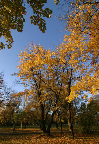
I took a walk in the park today and took a leaf out of Edward Westons book today in photographing the colour of autumn.

He's attributed with saying: "Anything more than 500 yds from the car just isn't photogenic." So rather than backpack my stuff anywhere, I went to the local park and looked for some angles. Here's what I took with the digital for my "light metering" shot


autumLeaves

I hope the LF comes out well too (but knowing my luck it'll be the test shot which is best ;-)

Friday, 3 October 2008

Epson 3200 more optimal scans

Now, normally everything goes well with easy things, but everything isn't always easy. Sometimes (as if by chance ;-) our exposures on film make scanning a breeze. Other times things work out to cause problems, other times we deliberately seek to make a challenge.

Anyway, the outcome of this experiment taught me something about both my scanner and colour negative film.

  • The scanner seems to respond differently to adjustments in the scanning software (meaning that changes in there are not only software and thus not equal to changes post scanning in Photoshop)
  • Colour negative film is much denser than I'd thought making it as challenging to work with as slide (although in an opposite area -> highlights)
So what did I do?

Recently I was working on 3 images taken for testing how Fuji Pro160S responds to over exposure. I took the shots on an bright sunny contrasty day, and was scanning them with a mind for putting them on my page on setting film exposure with a digital camera. That article also explores how film reacts to light a little as well (or densitometery using a scanner under a different name). Anyway, this image to the left was taken with my digital camera (not altering the exposure it chose) then plugging that straight into the film camera I then took 3 exposures;
  1. equal to the digital camera
  2. +1 fstop
  3. +2 fstop
I was surprised to find that not only did the shadow detail improve (expected) but that the skys continued to have tone (especially visible in viewing the negative on the lightbox). It almost looked like a regular HDRI but without the weird artifacts.

My first scans just contained washed out sky in the +2 exposure. So there was the challenge of scanning this "difficult" negative and getting all of what I could see in that scan onto my file to start working with. This proved to be a bigger test of my scanner than I had thought, and has taught me much about both colour negatives (their dye layers), my scanner and has coalesced much of what I've leant and heard about scanning in the last 10 or so years (as an amateur scanner).

In a previous post I explored the linearity of my (this) Epson 3200 flatbed scanner. In a more recent post about trying to get more optimal exposures and or scans of Negative I began talking to a fellow and in thinking about things and rescanning things I stumbled across an interesting point:

scan times varied with different settings of my scanner.

I had not noticed this before, although I had noticed that covering the calibration area on the scanner does also alter scan times. Some time ago I spent some time fiddling about with this in an effort to appreciate if this makes a difference and published my discussions here on photo.net.

As perhaps you can see (graph from my previously mentioned Blog page) covering the calibration area made little real difference to the response in the darkest areas of the negative. Sure the scanner perhaps increased exposure but as the density got higher (film got darker) the results were approaching the same. Probably the sensor was running out of sensitivity.

So, I went back to just doing things normally (not trying to fool the scanner.

It wasn't until I was testing the software NegPos. I was seeing decidedly more noise in the scans done with it than I was when I did plain "negative" scans using the Epson software to scan my negative as Negative. I thought that this warranted some exploration.

The first thing which is significant here is that NegPos software requires you do a full scale linear scan with your scanner (to make its internals maths easier), while when I scan with Epson scan I tune the the histogram in its software.

I have become sure that speckly noise in dense areas of scans of negatives is caused by scanner noise (things like the sky and clouds, which is also where "pepper grain" noise is located). However I noticed that when tuning the histogram myself I got less of this than with a full linear scan.

So, lets look at my process (and I suggest that you try to repeat theses results yourself).

The question often arises should I adjust my scan in the scanner softare or in photoshop? People argue that there should be no difference because this will result in software doing the same things just in different places.

This is only true if nothing changes about the way that the scanner obtains the data. For example proponents of vuescan will prefer to do a "linear scan" and save the raw data of that (which is essentially scanning as a positive and then inverting).

this next paragaph is complex, so you might need to read it twice:

As well, due to the I've found however that on my Epson 3200, with the driver in the Professional mode, that adjusting the sliders in the scan software further towards the dark area does make a physical change in scanning (I'm sure this will apply to 4870, 4990, V700/750 series scanners as they use the same software as far as I know).

For example a linear full range scan @ 1200 dpi of a segment of negative will take 1min 39 seconds while a histogram adjusted scan of the exact same thing at the same dpi takes just under 5 minutes.

That's nearly double the time. So I suspect that it is doing something like giving the CCD's longer exposure.

To repeat and summarize the above: I gained a change in scan time by just moving the dark slider to force the scanner to scan more of the dark area. This then may effectively be a hardware adjustment.

Lets look for some evidence to see if it may be. To cover any assumptions, below are the two different setting groups that I'm meaning with the discussion of settings. There is the all channel view and the split channel view:


On the left side is a full range linear scan, on the right is also a linear scan, but I have adjusted the individual channels to optimize what is in the range. You scan see they are still linear by the tone curve viewer (although there is much greater contrasts applied because the each cover a different range).

Note: Colour negative film is not like slide film in an important way (aside from being negative), each of the film layers reacts differently to light.

If you look at the chart to the left (which is the response curves for Fuji Pro 160S negative film) you will see that the starting point at the left is denser for blue than it is for red or green light. This is a point which confuses many (and took me some time to grasp too).

Essentially it means that if you expose a grey card as grey then the density (say, at -1 on the axis) for each channel will be different.

Don't glaze over here (as its easy to) as there is no magic to density, it just means how dark your exposed bit is on the negative. Look again at the histograms above and you will see that red is over on the right (indicating that it is not as dark) and blue is over on the left (indicating that it is dark).

So, to set your scan levels appropriate to each channel is exactly what is needed for film (and why simply scanning and inverting will look ugly and need work to fix. Scanner software does this automatically, but I have found it is far to agressive chopping off high light and shadow details.

Note 2: if you change the scanner mode to Film Type: Color Negative Film you will not get a straight line in the tone curve viewer and if you inspect the channels you'll find its more like this. Note that the location of the histograms is on the opposite end of the scale now. Also note the clipping applied (differently) to each channel.


To the left I've simply left it to defaults, to right I've used the Epson "auto exposure" tool. This is why I prefer to scan as positive and invert in photoshop later ... to avoid the software doing what I don't want it to

You can see that it is clipping some of the darker and lighter ends of the negative (probably just to make sure) and adjusting the slope on the gamma (contrast) to be quite steep and is setting different black and white points for each channel.

I could (and sometimes do) manually trim or tune these right here, but I thought that to get the maximum control over this I would scan as positve (so Gamma can remain linear) optimize the channels, and then invert and apply curves as required in my photo editor. I thought that the easiest "quick" experiment was to scan a portion of the neg in three ways:
  • full range linear scan
  • partial range linear scan (that is to reduce how far into the 'light area' I bother scanning but leaving the dark areas untouched)
  • lastly a fully "optimised" scan (where I look at setting black and white points for each R G and B colour channel separately).

To give you some idea of the differences I am seeing I've put below a screen grab of the three blue channel sections I obtained by scanning just this way.


I think you can see that there is impressively less noise in the optimised scan than the others (and the worst is the full linear scan). That there is this difference supports the theory that a scan is not a scan and that its not just the software making the difference.

This is what I got (with some playing with levels and curves myself) from my adjusted VS the Epson auto negative.


So with no effort Epsons stuff produces an OK result. But this negative had been "over esposed" by 2 stops to get better detail in the shadows (not to wash out the sky). So for me it was worth playing with this to keep that sky detail.

So if my theory is correct, and given that ColorNeg works with the full range scan its hardly surprising to find that there is some noise in the blue channel with this scanner. Compare the results of the two scans in the Blue channel:


So, for my scanner this settles the issue that setting the levels properly in the scan does make a difference. Even if I prefer the 'look' or the simplicity of the conversions that the CF software gives, I can't use it if I want to optimize my scans to keep away from the noise in the system.

So I'm comfortable with my workflow here with this scanner.

This is probably enough for most people (wait, I hear someone already crying out "No ... the short answer please!").

But ... for the gear heads among us I thought I'd try to see "why is it so". (the rest can skip reading now ;-)

Lets go back to our old friend the step wedge and see what happens when I alter the scan to make the input range from all R G and B from 0 to 50 (rather than 0 to 255).


Well, for one thing, we loose lots of data up the top there (but then that's not surprising). We can see we also loose linear responce of the sensor as its now gaining a colour cast. But what we really need to know is: is the neg denser than the scanner can penetrate? I think it isn't because when I put them both on the glass and scan them in this way I get the following.
Note that the blue spike is very marginally on the darker edge of where the darkest parts of the blue in the negative lay? This does however mean that colour negative is right on the limits of this scanner (not so for black and white negative though).

Correcting for this shift is non trivial btw, as you'll notice that the spikes are not aligned, this is much less so on a linear scan done more within the limits of the scanner.

If we measure the values of each of the known stepwedge incriments we can check how well the scanner performs optimised in this range. I've plotted this in excel taking a rectangle in the center of each of the steps and plotted this both as a value with a Log value of this (as the steps are in 1/2 stops) to check for its accurate responce. Beside this I've also plotted another graph with the percentage error for each step. This is provided by the standard deviation of the measured rectangle around the median (Photoshop does this for me) as a percentage of the value.


So as we get further past 15, the percentage error starts rising to above 20%. Meaning we can't really rely on the accuracy of the scan here (meaning increased noise). This means that we can't easily rely the points for red green and blue being where we may predict them to be. As I see it we have to balance by eye rather than algorithm. So pale blue skies and bright clouds might be available but not without some work.

Therefore just how we approach getting at the blue channel in the colour negative and how we adjust it carefully will have a large impact on the image quality and on the amount of noise in the skys.


So, now I understand more of why people say "scanning negatives is harder than scanning slides" as well as why colour negatives represent more challenge to scanners than black and white ones.

I would very much appreciate results of such explorations done on other scanners (such as Nikon or Imacon), but I expect that "drum" scanners will have far fewer troubles in this area.

:-)