Showing posts with label Negative. Show all posts

Tuesday, 14 January 2014

a Negative printing experience

I normally don't get my negatives printed until I've scanned them. This is because quite simply the places who print your film are incompetent (I really can't think of what else to say). Today because the shop didn't listen (more evidence to support my hypothesis) I ended up getting prints with my 24 exposures.

I glanced at them quickly and thought FFS

Item of Evidence 1


Now looking at the timber of the desk it looks like I see it here ... so my scan of the negative.


The blue light on the snow is classic up here, and as the sun is going down the sky was lit with low cloud and lovely reds. That's why I took the picture.

If I was a person learning about photography and all I saw was the print I'd be so disappointed with the my camera or me or something. But the issue is firmly at the shop. For if I take my file there (in sRGB colourspace) and print it, then it will look like my scan.

Item 2


shit, the ends of my glasses have more colour than this print.

My scan:


now I want to emphasize that I did fuck all to these scans aside from my usual process:
  1. scan as positive and set levels conservatively to not loose data
  2. invert in photoshop
  3. trim up levels
  4. apply some gamma to each channel
So its no wonder that people think prints from negatives don't look as good as digital prints. The real irony here is that negative was designed with printing in mind, not scanning.

I don't mind paying 5 bucks for the negative developing but the extra for the prints of this quality is just insulting. Sometimes you just don't get what you pay for.

Wednesday, 27 November 2013

why I love negatives

People may get the wrong idea that I don't like digital cameras, if that was the case I wouldn't be as supportive of and invested in and investigative of digital as I am. Its simply that they have limitations and I'm one who gets sick of "kool-aid" drinkers of hype who ignore reality.

So with that aside, I was just out yesterday with my old friend the OM-1 (and a roll of neg) testing my 28mm lens (after being surprised just how much flare my 21mm has when pointed straight at the sun).

I was wandering around the riverbank in the -4°C day with the intention of seeing how the river is freezing up slowly and testing my OM1 + 28mm f2.8 (200ISO negative) against my GF-1 (set to 200ISO) when I stumbled across this (among others) great scene.


Now, the red rectangle is in there because in my enthusiasm for examining the beauty of it, I took the digital zoomed in too tight, and the red rectangle is the digital framing ... and no I wasn't using a tripod ;-)


When I got home I scanned the film (dropped off at a 1hour developer) and looked at my digitals. The JPG's sucked but as I'd captured RAW I put the ones I liked through dcraw and got this 16bit TIFF from it.

Now its worth re-iterating that the digital is more zoomed in than the digital ... which will help the digital have greater clarity due to lower magnification. So with that said:

Film detail screengrab:

Digital screengrab:


the digital is just so luscious you could suck on it for a week. But the negative isn't so bad as to make you spit it out.

In particular I'm really impressed with the lack of 'grit' and the depth of the shadows details while still holding highlights. That's the reason I dropped the shutter speed to 30th, to get more shadow details.

Now bear in mind
  • that the film shot was handheld at 30th of a sec so higher chances of some shake
  • the digital was a bit higher at 50th of a sec (lower chances of shake and an OIS lens)
  • the film scan is of a much larger area
and I think that its fair to say that the Neg did pretty bloody well. The Nikon LS-4000 made this a peach.

So why am I mucking around with this still?

sure, the "war is over" ... digital won.  I guess noone needs to paint anymore either?

Well the reason for me to fool around with film still (apart from the fact I like some of the look I get with it) is that when I go on a 2 or 3 day excursion in -10°C (or lower) the batteries die on the digital unless I go to extreme lengths to keep them warm. So my plain old mechanical film camera just keeps keeping on.

Not to mention in the contrasty highly reflective lights of winter shots like this one below


are just not possible with digital without resorting to HDRI (and pray there is no wind). I'll leave you with this one from the same spot.


Film too ;-)

Saturday, 23 November 2013

looking into the (high contrast and bright) light

Recently I got the GWC1 adapter for my Panasonic 14mm f2.5 lens. I've written about that over here and here. One of the reasons for getting it was because I've been after something which equaled my OM21mm f3.5 lens (on film) in the micro 4/3 digital realm. So having satisfied myself that it was good enough for me, I then sold my other wide options (the Olympus 9-18mm zoom) and moved on.

The release of the Sony A7 camera has been very interesting for me, and has had me wondering again about if I should go to full frame. I like many things about full frame, but what I don't like is that cameras like the EOS 5D (and most of the new series lenses) are bloated creatures. I would quite likely not be carrying them, and thus (it not being with me) the best camera I had would be something else like my GF/GH camera (or probably my phone). I find it disappointing that full frame digital was only in such obese bodies while my OM series film cameras had been quite compact devices.

I decided to put a roll of 35mm neg into my OM1 and whack the 21mm onto the front and go for a walk with both cameras and see, as it happens I took these shots over the period of a week.

Firstly I was looking for any differences in "Shallow DoF" that could be obtained with a wide lens, because I don't always want everything to be in focus. So I took these two shots. Ohh, and all digitals were shot RAW and many and varied methods were employed to not have blowouts ... more on that in a moment.


GF1 + 14mm + wide
 

OM1 + 21mm


The perspective difference between 4/3 (4:3) and 35mm (3:2) makes them look a little more different, but essentially the horizontal view is similar between the two systems (and therefore I can crop the 4:3 into 3:2 no dramas) and the DoF is really similar. However I did notice that (when taking and then processing the shots) that the digital blew out in the highlights. Really that just shits me, and this isn't even harsh light compared to stuff I work with in Australia.

So I wandered around down to the river and took these shots:
GF1

OM1


This is the proverbial "chalk and cheese" and cuts to the heart of why I hate digital ... blown colours in real world situations. Sometimes this just isn't recoverable. The 35mm negative held the cloud details and the irregularity of where blown channels are (red often blows before green or blue) makes the clouds look horrible to me.

Perhaps with a lot of time on my hands (and I already tried using Adobe ACR, dcraw and Photomatix) I could perhaps work this into something nicer. But you know, you just can't recover data that's lost, you can only work it into something acceptable buy effectively "painting".

So this got me thinking (seeing those blinkies and knowing about this issue) that I'd give my OM vs GF a torture test. I waited for a clear day and took a shot looking right into the sun.

GF1

OM1

So, first impressions were:
  • holy shit my OM21mm had massive flare (and a lens hood isn't going to help here)
  • holy shit the blowouts on the digital are massive ... its pathetic
 Ok, so I dropped the exposure on the GF by two stops and tried again (shot on manual BTW) in an attempt to give it more room, and got this:


The blowout is less, but geezuz its still hot. Lets take a closer look...

GF1

OM1

Which actually has details and didn't blow the channels of Neg (but must be hitting hard I have to say) ... just amazing. Tweaking the contrast and you can actually see the graduation to the disc of the sun!

  • A better lens would fix my film camera shots lens flare, but nothing will fix the digital.
  • just how far do you have to under expose to not blast out the digital (and at what expense of the shadows) 
  • the clouds around the sky in the digital are artifically red due to channel blowouts
The astute (looking at the 100% images) will also notice on this that the 35mm shot enlarges bigger because the 35mm film scan is 5590 x 3780 pixels while the GF1 is 4000 x 3000 pixels. That's a bit more than 25% more pixels to play with!  So you could either print large or scale down and clean up the film grain to have the print looking nearly as smooth as the digital.

So where does this leave me?

Well while my intention was to see how my lenses may "look and feel" on the Sony A7 this exersize has left me wondering if there is any point in moving systems from micro4/3 over to the Sony full frame system, simply because no matter how many more pixels (and I've got enough IMO already) or how much the larger format is going to look better I'm still going to be stuck with the dynamic range issues of digital.

So compared with keeping 35mm neg and micro4/3 (NB going to the Sony A7) I would
  • rationalize bodies and lenses (being able to use the 35mm lenses on both systems)
  • but still need to carry a 35mm film body for high contrast work
and still need to spend a bundle on the A7 (and more or less be only getting a small advantage?).

The wide lens on the 4/3  did give me sufficiently shallow DoF for my purposes and quite enough resolution too. So as long as I don't get blowouts (and I have enough experience to predict that) and since the GF/GH camera is about as compact as the Sony (and really how much more compact can it get?) perhaps I don't get much extra bang for my thousand bucks??
That would be body only and selling my micro4/3 gear to offset the price, so I'd still not have any AF lenses then) at lest with a EOS camera I'd have a couple of EF prime lenses too.

So maybe I won't get the Sony just yet ...

Saturday, 23 July 2011

digital vs neg: Australian light

Back in Finland I compared my m4/3 camera (Panasonic G1) to 35mm film and found that in situations of higher contrast that negative film captured the scene better and that in situations of lower contrast digital revealed more of the subtle textures.

As Australia has different light to Finland (perhaps more contrasty) I wanted to explore how well my findings held here. It was also an opportunity to compare fuji frontier scans with what I get from my Nikon LS-4000 as I have done previously with Noritsu systems.

As mentioned in a previous article, its amazing how well negative does in coping with contrasty light like this:

Good shadow details, great highlights.

summary


I was impressed how well I could pull images out of RAW files from the GH1, with the right processing tools you can do outstandingly well compared to negative.

Noritsu machines scan better than what you get with Fuji Frontier

Getting a high quality scan out of a Frontier operator is like getting milk from a stone, and you just wouldn't buy a digital camera producing as few a megapixels nor as shitty a quality.

discussion


So, getting on with it, I made the comparison using my EF 24 f2.8 lens on the 35mm camera and the 14mm end of the 14-45mm Zoom on the GH1. I was expecting that the 14mm would equate to 28mm on the 35mm frame, but wondered how aspect ratio (width over height) would effect this.

I used Photomatix 4.x (which has a nice little batch processing mode) to process my RAW files to get that little bit more out of the file (for that little less effort). See my posts here and here about that.

As it turns out the 4000dpi scan of the 35mm frame using a 24mm lens produces pixel for pixel sizes which are quite close (but not 100% exact) to the 14mm lens on the 4/3 frame. The angle of view and amount of scene captured varied ... you can see that below where I've overlaid the frames as best I could.

So the 24mm (as expected) reveals a wider frame than does the 14mm on the 4/3. You may notice how well I've matched the colour and contrast between the two VERY DIFFERENT media.

This makes comparisons a bit tricky as at 100% views (pixel peeping) because magnification is different, just as 100% views of a more telephoto image will reveal more detail than a wider angle. Essentially the digital has a slight 'resolution' advantage in this. None the less...

So, lets take a look at a central portion of the image where there is some shadow detail and bright reflective objects in full sunlight.

Firstly, I see that seven though the 35mm image covers a wider capture than the 4/3 does the feature size of things on the scan is actually a little larger than on the 4/3, which is impressive. The dynamic range capture is pretty equal although the digital looks a little punchier which suggests it wouldn't quite be up to the wider range of highlights than the negative is.

Next I notice that there is greater details in the brickwork and lovely smooth texture in the wall of the building on the digital.

This smoothness of texture really shows itself on skies:

The smooth clear blue is perfect and the small clouds are almost lost on the negative. I guess this is where film folk liked Slide. But to me if you're going to swing with blocked up shadows and blown highlights that slide film brings (without a projector) then you just may as well use digital anyway.

The digital from RAW with this processing is impressive stuff and makes me really question where and why I'd use negative ... I'll need to test this again on a 5D and see how that goes. I've read they have less noise in the shadows than the 4/3 does, which would really assist with this sort of processing.

Lastly I thought I'd present a comparison with the out of camera JPG and the RAW processed in the manner I work with.


Look to the left over at the building and see how much better the contrast range is reproduced, check out the shadow details under the trees, and generally just how much punchier it looks. Sure you may not like the saturation, but that can be dialed down easily!

Lastly I'd like to present 2 images take looking into the light:

Negative:

Digital

the sky blowouts are a little offputting on the digital as is the slightly garrish colour which no doubt came from handling highlight recovery of blown channels. Clearly some HDRI or plain old under exposure would help with on the digital, but then the shadows will either be ink or noisy.

So Negative still copes with the really harsh conditions better ... well in my view at least.

conclusion

The Photomatix processing of RAW files (automated batch) is now giving me in full sunlight the sort of contrast handling that I once reached to negative for, meaning that I'm now more inclined than previously to reach for my 4/3 digital than I am for negatives. There remain some issues which digital needs to be handled with care.

Its not black and white is it :-)

Wednesday, 3 February 2010

shoot with the sun over your shoulder

My Grandfather (who gave my my first 35mm camera when I was quite a little fella) gave me the advice of
"when you take a picture, put the sun over your shoulder"

no wonder all our family photo's show people squinting.

While the lighting on that is at least predictable to work out, its not ideal and tends to look un-interesting to me at least. Everything looks a little samie samie, so I like to do things sometimes which go against the rules, like shooting into the sun, which gives me results like this:

snowyJarviRuokodigital

now this is a digital and while its a nice picture, I think it looks a bit awful in the sky around the sun ... now if it wasn't for the fact that I've used negative film for years I would not have any other expectation. Note the nasty colour cast shifts around the sun where the clouds go red (as the channels blow out at different rates).

Now, lets look at the same thing photographed using (400ISO negative):


Not bad is it. Actually I often use my digital to make a metering evaluation when I'm using film on my big camera which doesn't have a light meter (though don't bother when using my EOS film camera cos its light meter is something I'm already used to and Negative has so much margin for error), I expose for the shadows and let the high lights fall where they may. Now at the time of taking this, I took some different exposures and focus settings ... so here is a scan of these frames all laid out on the flatbed (this is 6x12 size on 120 roll), being this size they won't fit into holders in pairs of negs, so they get cut into singles.


no matter which exposure you look at (my exposure above came from one of these) the sun isn't blown out among the clouds (meaning you can see where it is).


This really shows how well film does in this sort of high contrast environment.

I was in Tampere yesterday taking some photographs, and having this information up my sleeve I thought I would try something like this with the digital.

This image is a HDR from exposures spaced 2EV either side of "normal".

Looking at this it is interesting, because while the level of blowing of clouds is better than the top pictured digital image, its still not as good at handling the high contrast as the film image in my opinion, and this is HDR.

For gods sake just how much head room do you have in Negative? Well that's not a fair question as one of the characteristics of negative is a built in rolling compression of high lights which approaches infinity : 1 as you get into higher light levels.

This again backs up my previous findings that digital does much better than film when working with low contrast even lighting (like in a carefully setup product shoot or working in the magic minute of evening light), but film just walks all over everything when dealing with high contrasts such as shooting into the sun or typical outdoor light in places like Australia. Shadows don't have to be as black as squid ink folks ...

For example, 35mm colour negative ...


Try that with a digital...

So when you read people saying that film and digital are different media and they can exist side by side this is part of what they mean.

My intention with this article has not been to say film is better than digital, or the other way round. But black and white decisions like that are like saying that a circular saw is better than a hand saw or that a small car is better than a big car, it all depends on what you're doing and what your needs are. Not everything is a nail you know...

In my case the digital does 90% of my photography, but I just won't pass up the film (even 35mm) just yet. It may be that film does nothing for your photography, or it may be that it helps some times ... I know that its annoying to carry both, but sometimes I do that.

If all you do is digital and your finding it occasionally limiting, why not give film a go? It won't make you a better photographer, but it may solve some problems if you happen to have them.

Tuesday, 2 February 2010

the colour version

Hi

in my blog post "standing on a bridge that's gone" I mentioned that I was doing a colour negative 6x12 of the following digital


snowyJarviRuokodigital


well here it is ...


I think its more natural (and doesn't blow out the sky). With the digital, I could have metered to prevent hi-light blowout, but I always meter for film to get the mids and shadows looking good on the digital ... the Negative has more headroom (and natural compression) than the digital. If I had chosen to expose more carefully for that on the digital I know from experience that it would be quite noisy in the shadows.

In some ways its of course a similar sort of look and feel the the black and white ... (here is an ADOX sheet of 4x5)

but with (in my view) better colours than the digital. To be honest I reckon I'd need to have gone down the HDR path (and hope to shit nothing moved) to get a better rendering than the Negative ... which btw was 400 ISO.


In case you're wondering how much detail was on the negative, well here is a 100% section from down the bottom ... and this is only a 1200 DPI scan with my Epson


not bad ... sometimes the big camera is worth the struggle

Tuesday, 5 May 2009

digital vs (35mm) film, scans screens and prints

I've always had the impression that things should be as they seem. Sometimes they are, and sometimes they're not.

There is a debate which started in about the beginning of the 21st century about is digital as good as film, which has morphed into which is better digital or film. This bit of history in itself is a good bit of evidence as to the advances and development which digital photography has undergone in the last 10 years.

Looking at the market it would seem that the question is well answered for the 35mm film segment. Digital would seem to be better than 35mm if sales are anything to go by.

There are however a group of folks who still remain advocates of 35mm film and suggest that it can obtain better results than cameras such as Canon's 5D or 5DMkII or Nikons D3X. Now that's a pretty mean ask as even the 5D (a camera released 4 years prior to this writing) has a very flat sensor (flatter than you're ever likely to get film to sit) which divides the 36x24mm area up into 4368 x 2912 pixels. Now if we think about this in terms of film we would need a scan of 3082 dpi to equal it.

Not so long ago the Nikon LS IV ED film scanner was considered to be quite the animal to have as it did 2900 dpi scans of your 35mm. However even I felt (back in 2001) that 35mm was as good as (then) $2000 digital slr cameras, with film potentially holding more detail than 2700 dpi scanners could retrieve. For instance using my Nikon Coolscan LS-20 (a 2700 dpi scanner) from this overview:

provia scan sourced image

I could only get this level of detail:

Detail from Provia scan

while looking into my Pentax microscope I see this. Now forgetting the chromatic aberrations created by poking my Nikon coolpix into the eyepiece directly you can see significantly more balcony details there.

?

Clearly there is more there in the 35mm slide than this scanner was getting.

Time has moved techonlogy along a lot since 2001 and cameras with much larger sensors than what I was comparing film to back then are not only around, they are actually cheaper than a good scanner!

A recent claim on a forum suggested that people were prefering DSLR's over 35mm film due to poor quality scans. So combined with all the above mentioned changes leads me back to answer the question again in the light of all this change and to my present test.

Given what I've personally seen with my 35mm film and my digital I disagreed with that claim. Now keep in mind that I'm a photographer with a history in film, a serious investment in film photography gear and a small one in digital. You would think that I will be biased towards film then. Well I am ... just not for 35mm.

Anyway after I got my first good DSLR (a 20D) I did a few tests and came to the conclusion that it was quite close to 35mm with some advantages to the DSLR and some advantages to film. I I've scanned a lot of my own film as well and am occasionally simply stunned by what I pull out of negatives I exposed around 10 years ago.

To settle the question for my self as of NOW with access to the best film scanning equipment, I wanted to compare 35mm film with a DSLR in a way that would give me an answer for how I use a camera.

As I don't have a full frame DSLR (same situation for many I'm sure) I chose to compare things framed equally. To do this I needed different lenses, so my test cameras were:

  • Canon EOS 630 + EF24 f2.8 lens at f8
  • Canon 10D + Tokina 12-24 lens at 15mm and f8

This gets each to capture the same image.

Now for the contentious issue, film choice. I happen to commonly use negative film and use 160ISO and 400 ISO films. While there will be some who will argue that I should only compare to ISO50 slide films like velvia, I didn't want to do that. Here's why:

  • velvia vs digital has been done to death
  • most people don't use velvia, and I'm sure looking at camera shop shelves that 200ISO negative is a common choice
  • DSLR cameras do very nicely at 400ISO (with newer ones doing spectacularly at 1600ISO) so why hobble them when people want to use these tools
  • I personally believe at this point in time that negative gives better results than slide when making a colour profile is not the prime concern. In this page I show my reasons for preferring negative, while some grain is apparent there is also better sharpness.
  • finally, if you're really going to go to all the trouble to use ISO 50 slide film, angst over your exposure with a spotmeter, mount the whole kit on a good steady tripod, focus carefully then why not put a good 6x7 (or larger film format) camera there in the first place.

What I did for this compare

So with the above mentioned cameras (mounted on a tripod) on a bright sunny winter day I went out and took this image with both camera systems:


Plenty of shadow areas at the base of the trees, plenty of scope for pushing the resolving power of the systems with fine scenery details and both high contrast and subtle textural details. From the 10D I used the CRW raw file, and to get the the negative into the digital domain I have done and had done scans with:

  • Nikon Coolscan 4000 @4000 dpi
  • Epson 4990 @ 4200 dpi
  • Drum scan @ 4200 dpi

The results are quite interesting and perhaps easy to guess at. Here's the images

Drum scan of film


the Digital


Clearly they both look pretty similar. Now don't discount this comparison as "just the overview" as its important because it contains mainly the lower frequency information. Not the details but the tonals, the bass and midrange of photography HiFi. Assuming your monitor is OK its much like looking at a 4x6 print from each. But click on each and compare them in a larger view and you can perhaps get more information from that too.

Details

Now, lets look at some detail segments. The base of the Birch tree cluster in the left is were I focused and provides some interesting details to examine, as does a little cluster of brush on the middle right foreground. Now these are 100% pixel crops from segments of the

Drum scan


CRW Tiff file


of course they're slightly resized in this window, so click on each image to load the full thing.
But I bet you're in for a surprise.

Now, aside from the issue that the scan from the 35mm negative being bigger (which will have an important advantage discussed soon in printing) does the 35mm film really have more detail? To me the answer is not much, but not less, perhaps in the high contrast high frequency areas (like where thin branches and twigs are over snow) , but certainly not in the area of low contrast low frequency tonals like in the textures of in the snow (look again more carefully in the shadow areas of that ditch).

There was no wind on the day and shutter speed was quite high (250th of a sec) so there is no argument for blur of the small branches.

While it may be that the drum scan from the 35mm is larger, it does not seem to contain significantly more details  (while it does provide more grain).

What it certainly does not contain is the the levels of tonal details in low contrast areas. You can see this clearly in the snow areas and in the small ditch. It is most startlingly clear in the ice chunk in the foreground. Shadows are absent and subtle tonal details nearly hidden. For example

Drum Scan


CRW


Remember, both these are 'ressed down' on this display, so they look better. Please click the image to download the full size.

To pixel peepers this reveals an important issue, and one often misunderstood:
that looking at straight pixels can be deceiving
While the drum scan looks like a popcorn noise fest the image does look better when the size is reduced. This happens somewhat in printing, but if you try to print this at 300DPI it will look grainy while if you take the digital file and print it at 150 dpi it will look as you see it.

Essentially this means that the image from the digital camera while smaller can be printed at lower DPI or rezzed up make a print of similar size to the 35mm drum scan which is so grainy that it must be printed at much more than 300 DPI or rezzed down.

This aspect of better low contrast definition in digital is not a finding unique to my own experience. On a photo.net thread the following images were posted by Richard Karesh (used with permission). It was observed that subtle tonal details were present on the DSLR image that were lost in noise in the film scans.
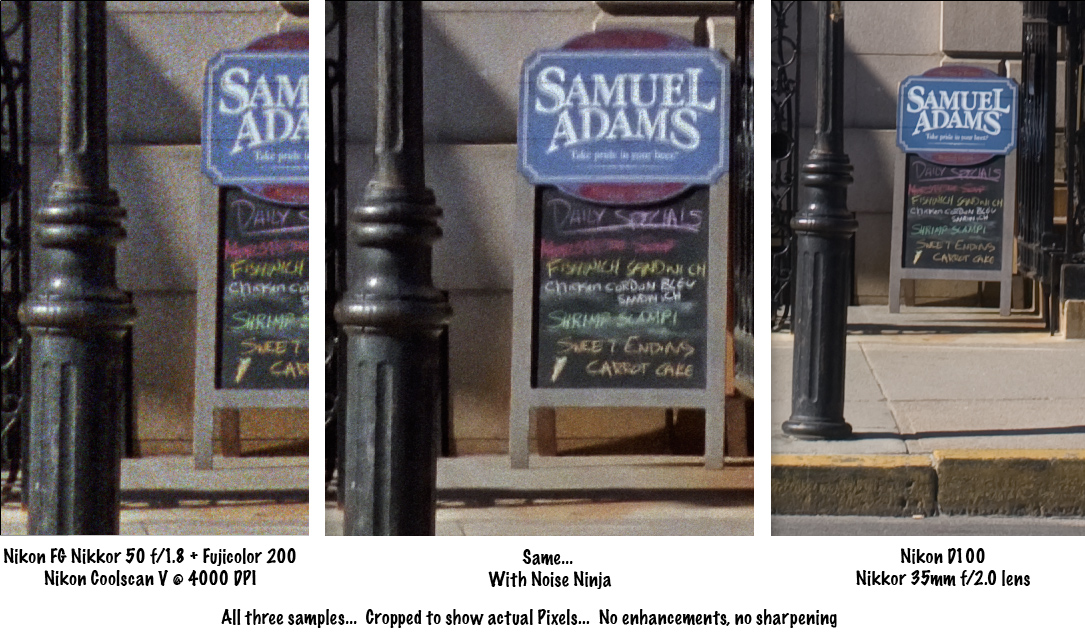

and again rescanned here
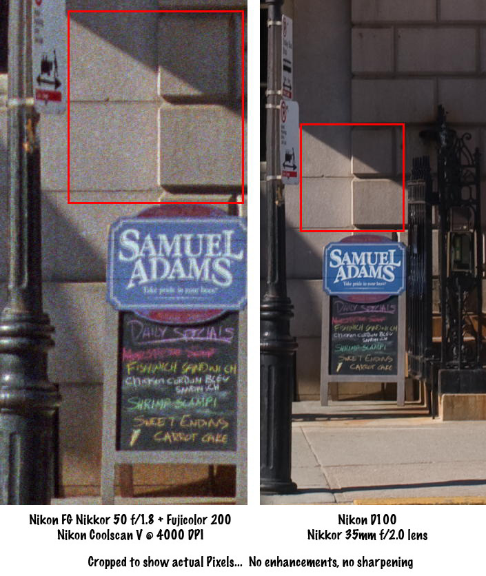


So things are not always as they seem.
Perhaps 35mm does hold more detail, but if you chase it you are like a cat staring at the fish tank ... there seems to be food in there, but you just can't get it out.

Now, having seen the drum scan lets look at what I could get with my Nikon LS-4000


and an Epson 4990


both done using my preferred way to scan negative as a positive. Looking at pixel level details really shows how well the drum scan performs. In fact it makes for interesting analysis in itself. If you apply a 1.4 pixel Gaussian blur across the drum scan image it starts to look like the other ones except not as precise when it comes to a spatial mapping of the pixels. But I'll talk more about that below.
A quick plug for the fellow who did my drum scanning. Very accommodating fellow in the USA, he normally does not touch 35mm formats, so if you wish to send your 120 and 4x5 films to him I think you'll be more than pleased with the results. Sure noone sane will want 4000dpi done from 4x5, gosh that's 20,000 x 16,000 pixels or 320 megapixels could you even open the file?. But looking at the spatial quality as well as the sharpness (without any sharpening applied) its just astonishing. I'm not sure about Sydney but in Australia its hard to get good drum scans at a reasonable price.

After reviewing this its to me now its an open and shut case, DSLR with APS-C or larger sensor of greater than 6Megapixels will mean that there is no advantage in using 35mm colour film for either sharpness resolution or pretty much any other reason except black and white (including and especially IR Black and white ). Its also possible to recover those high-lights in the CRW file but I didn't bother to put much effort in to it (ohh and for the record the CRW is processed to a TIFF using dcraw then worked on for tonal adjustments).

Now before you go nuts about the obvious "grain" in the picture from the drum scanner lets move on to:

Screens and prints

this is of course the problem I can't show you prints on the www, but I can scan some and show you. But first I'd like to mention something about what will happen when printing.

Blur

One of the aspects of making a print is that some blur is going to occur. For instance if you are using a laser to expose RA-4 paper then the light dot will also illuminate the paper causing a little glow around that point.

If you are using an inkjet then the ink does not have nice square boundaries like the pixels on your display.

So it doesn't matter if your image is hard and sharp or full of broken up bits (as in offset press) the blur will soften it up as in the example to the left.

Just how much blur happens depends on a few factors like how small your printing pixels are and your enlargement. If you take the drum scan segment, scale it to 50% you'll see that the image looks 'neater' already as the noisy pixels are shrunk. If you were to then print that at 300dpi you'd get even more 'smoothing' of the noise by the printing onto paper blur mentioned above.

So, if we took that drumscan and printed it at 300DPI we'd get an image about 50cm wide (that's about 19 inches for you folks still working in inches). This is big no doubt about it, so I took a crop from the image to make a 10x15cm print at 300 dpi. I then made a copy of this and applied a mild 1.1 pixel radius blur to one of them and took them to the local place with a RA-4 system and had them printed. Here they are scanned on my Epson 4990 flatbed (yes, the prints).

NOTE: to keep it clear what print was which I used photoshop to put text onto the print, this renders quite sharply in the image and you can see the difference between the print and the image file when you look at the text.


There is still some sign of the 'noise' in there but printing makes it more tolerable and viewing distance normally associated with a 50cm wide print makes it all but invisible too.

Actually there is a little blur occuring in the RA-4 print, below is a sample of a scan of the print compared to the file (screen grabbed). The prints were scanned at 1200dpi to make sure I got the fullest amount of detail from the surface (and not introduce my own blur). You'll notice that the magnification of the print is 25% in this window.


Clearly the interaction of the light to the paper is also intensity dependent as applying a Gaussian blur to the file was close, but not perfect. In the following image I have restricted the viewing to the blue channel only (so as to avoid all the noise getting in the way of comprehension).


and then I have applied a blur to the JPG to attempt to match the print


its close, looking at the foilage you can see they are nearly the same, but looking at the dense text note the darkness (created by a much brighter light in the printing) spreads further making the font almost look bold.

So understanding what you will get on the print is very hard to replicate. You can get some idea but you'll really have to print it to see. Sounds tough but its apparently true. Certainly your own printing experience will give you some better guides as to what to expect, but it seems that what at first seems like a "pop corn fest" in the maximum enlargement drum scan when printed seems more reasonable. More so when printed a wee bit smaller it will only be better.

So it seems that I could print the CRW file with a modest upres on a Durst Epsilon (native res of 254dpi) up to 50cm and its overall cleaner image will still look neater than the image from the 35mm film which can't really be printed at such low DPI without that noise standing out and certainly won't tolerate the upres.


Science not religion

because I am a science trained person I don't expect anyone to simply believe what I say (although who knows ... a well presented argument may even be used as a citation later if accepted). Results of tests should agree with previous tests (assuming similar methods). I find that this work fits within other work I've done; here and here. My results should be replicable in your own testing too.

So if you've done some testing like this and have different results I'd like to hear about it. I will publish any links in the comments to work which attempts to repeat this comparison or aspects of it.

So, accordingly I am happy to make all of these files available for anyone. I can send you the files I used for printing too ... or simply post you a print if you send me the costs of postage and making a print should you live somewhere where you can't get a print made for a buck or so.