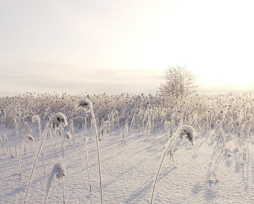
in my blog post "standing on a bridge that's gone" I mentioned that I was doing a colour negative 6x12 of the following digital

well here it is ...

I think its more natural (and doesn't blow out the sky). With the digital, I could have metered to prevent hi-light blowout, but I always meter for film to get the mids and shadows looking good on the digital ... the Negative has more headroom (and natural compression) than the digital. If I had chosen to expose more carefully for that on the digital I know from experience that it would be quite noisy in the shadows.
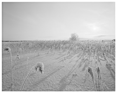
In some ways its of course a similar sort of look and feel the the black and white ... (here is an ADOX sheet of 4x5)
 but with (in my view) better colours than the digital. To be honest I reckon I'd need to have gone down the HDR path (and hope to shit nothing moved) to get a better rendering than the Negative ... which btw was 400 ISO.
In case you're wondering how much detail was on the negative, well here is a 100% section from down the bottom ... and this is only a 1200 DPI scan with my Epson

not bad ... sometimes the big camera is worth the struggle


No comments:
Post a Comment