The work for this post started out as being an exploration of formats, and ended up telling me more about working with colour negative VS digital in smaller formats (where you need to scan at higher resolutions).
I still use a 4x5 camera (especially for black and white) where I don't think my digitals can out do it so easily in detail (although if I had a 5D and TS-E lenses it will be really close) and certainly not more dynamic range than black and white negative (need HDR to address that).
Sometimes I still think about using 35mm film too ... now if I had a 5D or "full frame" digital camera I'd probably even more seldom think about using 35mm film, but I don't. Now as Full Frame handles normal to wide differently to smaller format digital I found myself wanting a shallower depth of field for a particular photographic style.
For example, I thought the other day (about an up coming family event):
"will I use film for some of the shots, or will I just use the G1 and some legacy lenses like my 50mm?"
My issue was background separation of people group shots. So I went to the car park and took some shots of my wife in a situation which will more or less be like where the family will be.
I was thinking that for a 'wide' lens like a 24mm I could get better background blur with 35mm than with my kit zoom on (at 14mm) wide open.
Shots like this one taken with a 50mm at f2 on 35mm film were great stuff ... providing emotion that would be missing with a perfectly clear background.

I was interested to see how well it would go with wide angles (as I might need to be in closer)
So ... This is an overview I took with the kit at 14mm

then I scanned my 35mm negative (200iso) on my LS-4000 (using my famous cunning method for getting better results than obtainable by using "colour" setting) but in close at 100% pixels an entirely different thing emerged to be in my face (more than the diffused background) .. noise.
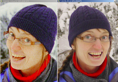
NOTE: I scaled the film scan to be 3000 pixels high (as 4000dpi makes it a bit more) to make a better comparison keeping size and scale similar.
Dam, in this soft light the digital image is just so bloody clean.
What's going on here?
Because this was daylight film (don't know what that means? click here) it was quite tricky to bring the colour balance back to looking like the digital (took me about 10 minutes). Also the fact that I did not use a correcting filter on the film camera shows to me how much worse the noise gets in colour negative film when you mismatch the three component colours (blue signal was pushed hard as there was more blue light than red in the overcast and snowy conditions). This showed how well the digital does in coping with this in its auto colour balance.
Rather than describe this, lets look at the channels individually ...

I don't even need to tell you which one is the blue channel, and as you can see it sucks don't it ... this then gives rise to channel noise which results in speckles ... especially in the blue things in this case.
Unlike slide film, negative does not blow out as ungracefully with over exposure (same as digital really) but as the various channels get more different it gets filthy in there ...
result = noise
Getting back to the backgrounds for a minute, to me the G1 didn't really loose soooo much in diffuse background as the larger format film did and is hardly noticable on smaller prints (my guess is noone wil pick it), but the film looked ... gritty ... and looking at the blue tuke noisy.
If you like it great ... but it lacks in smooth textures (look at the skin tones in the shadow under the chin).
This is said by one who has some OM lenses (used on my G1) and still has an OM body as well as some Canon EOS film bodies and EOS lenses ...
So, now I need to wonder "is a 5D worth owning for the few places where its larger sensor provides advantages?"
:-)
PS
Noons made an interesting point in his last question, so I thought I would post this here rather than just reply (as this way I can include a diagram).
The Nikon somehow produces images which are at a pixel level sharper than that from the Epson. I am not sure if this is only the LED light source or the optics on the scan head. In the image below you can see that the Epson (left) is somehow more diffuse and softer than the image from the nikon. The images below (link to) 100% views but are represented on this page at 50%, if you want to inspect the 100% click the link to take you to a flickr page.
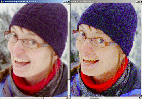
Not only do you see the characteristic soft light look to the Epson but you see more noise in the blue on the Nikon.
Now that's not to say its actually less noisy, its only when you zoom in so that the pixels are taking up 4 pixels on your screen (well 4x4) that you can see that somehow at a pixel level the Epson is softer.

There is what I can only struggle to describe as some kind of Gaussian blur at a radius of a about 1.1 pixels present. So there is "blotchyness" there but is a little more diffuse and thus less obvious than the noise of the Nikon. Looking at the rim of the glasses you can see that the definition of the edge is sharper.
To demonstrate this I applied a 1.1 pixel Gaussian blur to each of the R G and B layers of the image from the LS4000 ... they're starting to look the same now aren't they.

In some ways the Nikon reminds me of what I see in drum scans. If you go back to my previous page where I compare drum scans of 35mm to my 10D here you will find this image (same negative stock btw).

This shows the same level of pixel colour noise (although presented differently) as I'm seeing on the Nikon LS-4000 (btw the scanner operator didn't think the amount of noise on the film was outstanding).
I suspect that this is related to the many compromises and cunning tricks that the designers of film have had to pull ... as the signal processing is in many ways built into the film layers and dyes. For instance (from personal communications with another author on the subject of characteristic curves of C-41 neg and the "masks") :
If you were to look at the H&D curve of a single layer cyan, you would see that it has green and blue density in addition to its primary red density. These are impurities.
By adding a variable green and blue mask to the cyan dye (the mask), the unwanted signal is turned into a constant value which is ignored during the printing process. You cancel the negative blue and green with positive and identical blue and green curves and get a constant that is at the dmin of those curves. Thus, the actual dmin must be orange as there is a red mask (blue + green correction) in the cyan layer and a yellow mask (blue correction) in the magenta layer.
So for extreme magnifications (like 4000dpi scans tend to be) I still have some reservations about negative films. I prefer their reactions to light levels (greater hilight preservation than slides) but find that they are complex animals to scan well (and peraps print well, but I've never done this).
I still am not sure what the answer to this is, but I'm left feeling that nothing is perfect in the world of colour photography, neither neg nor slide nor digital.
no wonder I like black and white


4 comments:
What film was this?
Had this same problem with the Fuji Pro160S and C film, which I was told a few years ago was the best colour negative.
It isn't. There is much better nowadays.
I use now Ektar 100(iso100), Fuji Superia Xtra-400(iso400) and Fuji Pro800Z(iso800) for colour negative and have never looked back: none of these problems with the blue layer!
And with a bit of Neat Image (latest version) it all goes away anyway, no matter what. Only really underexposed stuff (> -2) gets hard to cope with.
film was Agfa Vista 200 ISO, its of course discontinued. I picked up some from a sale.
I should do this again with 200 ISO
Superia or something.
FWIW my Epson did not yeild as much noise (well, perhaps cos it doesn't yeild as much detail ;-)
Hmmm, I don't think the Epson would give you any significantly less detail, particularly with the attention you give to the workflow.
I'm still a firm believer the best light source for scanning older film is a diffused one.
Ie, precisely the light source of the Epson flatbeds!
The Nikons with their LED hard light are much more suitable to modern film which already has the "shiny" on both sides of the strip as well as much more regular grain in all three emulsions.
Exception with the 9000, which has a "soft" LED light source.
It's a similar problem to the one we had with condenser and diffuser light source enlargers, in the days of chemical positives.
Any film with so much as a scratch would print horribly with a condenser, while with a diffuser it'd be hard to see any flaws.
Hence why diffuser heads were preferred for colour negative printing, as opposed to a condensers with filters. The latter were preferred for b&w, where flaws were easy to fix with "painting" on the positive.
Interesting! In the image with the gaussian blur Nikon and the Epson native, the blotches are in the same places in both and larger than the detail visible in the Nikon original scan.
That to me means the blotches must be a layering or scan artifact rather than an inbuilt effect of the grain - or rather die clouds, as colour does not have grain as such.
But as you well mention, there is a lot of die and layer "magic" going on anyway so it's really hard to say what is or is not a scanning problem or a natural film effect.
Mind you: with new Ektar 100 this whole scenario changes again! I've been watching it on the microscope and it is completely different from, say, K Gold.
This is what to me is fascinating about scanning: getting to identify, distinguish and work around all these nuances and small differences between all the films and how scanners react to them.
There is certainly a lot to be said for the old adage: "pick one film and stick to it"!
b&w is so much more consistent, isn't it? :)
Post a Comment