As I was writing this blog idea it seems that some other people are also working in quite a different way to me to draw public attention to the short comings of the science involved in the climate change issue.
As I've mentioned before I am still unclear on the issues and facts that surround global warming, however something which I am more clear on is the effects of over development. It seems to me that this entire "Climate Change" debate is overshadowing this sort of more practical discussion.
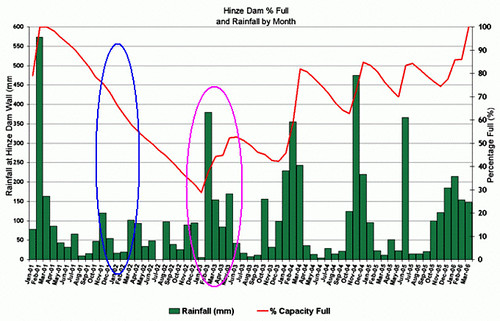
For instance ... back in 2002 ~ 2003 the city of the Gold Coast was running critically close to the limits of its water supply. Below is some data which was sourced from the GCCC website that monitors the Hinze Dam Levels. I have added 2 ellipses to this which I will discuss in a moment. I would like to give you the link (which is here), but this data is no longer published on the GCCC website as it once was, only the less meaningful data of 'consumption'. I'm sure many Gold Coast residents are familiar with this graph...

The red line in the graph tracks the dam level as a percentage, my blue ellipse shows the period of January through March which is normally the wet season for this region. As is clear from the graph the dam levels fell to less than 30% capacity just prior to the onset of the (slightly late) wet season of 2003.
Clearly this was quite a worrying time for both residents and council.
During this time a contracting company was employed to reassess the yields of the dam system. The consultant presented the (quite reasonable) proposition that Estimation by Historical Simulation was an appropriate methodology. They proposed a method of analysis which looked at remainders after periods (rather than something state over time). The decided on the simple formula of:
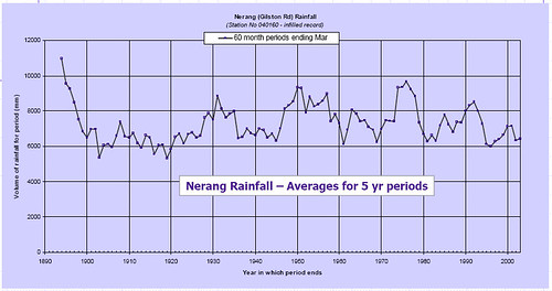
Storage at End of Period = Storage at Beginning + Inflow - LossesSounds reasonable but ignores an important point which I'll come to later, additionally it has another strange view ... in determining the Inflow they presented the following model to Council and members of the public:

some interesting issues arise from examining this data:
- Why was a 5 year period used? (to iron out the wrinkles?? of high and low)
- Why were periods ending in March chosen? (ending in the end of the wet season on a 5 yearly period?? like what difference would it make {my calculations show nil})
Notice the word Average in the above data chart? Now the definition of average is to add up a series and divide by the number of elements in that series.
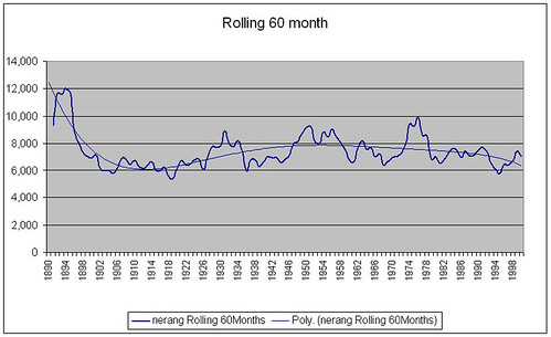
I attempted to validate their data so using data sourced from the Rainman application (the same source as them, Bureau of Metorology) I obtain a almost identical result taking periods ending December and over a 5 year period (60 months) but not dividing by five.

So it appears that this data is obtained by taking the sum of the 60 months and not an average. If we then divide that data by 5 to form an average we find that the scale on the graph now comes much closer to that we expect from yearly rainfall data.

One can only hope that this was never used for real calculations on expected inputs to the system ... although I suppose it may have been. If it was not, then what is the purpose of this data? I can only surmise that the Ronald Coase "adage" was used in the construction of this
torture the data long enough, it will confess
Does this mean that figures between 6,000 and 8000 were used?
It is interesting to note that the peak lows of average yearly rainfall data fall significantly lower than the values provided by the rolling 60 month average. What is the purpose of this model as when you compare this with the empirical observations in Fig 1 its clear that the usage rates (based on the fall of dam level in the absence of significant rainfall for addition to its level) will not support two consecutive years of low rainfall, something which the above model seems not to yield.
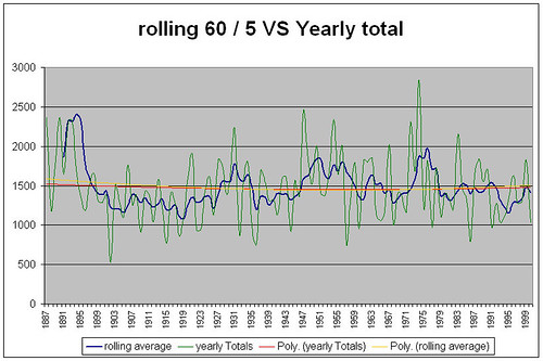
Lets look carefully at the critical period of 2002 ~ 2003, the figure below contains that component in detail.

there is nothing to suggest from this model of stream flow *(the blue line, not the yearly totals) that the water supply would be in any more danger of reaching the point of failure to meet community needs than in other years, in fact 1996 looks more threatening to the water situation.
The fact remains however that it was. Given the climate variability I have no idea what this person was trying to do by presenting this. Was it just to show fancy lines and baffle people with bullshit?
Getting back to my important point before, it may just be that their model would be accurate, and at the end of a 5 year period that the dam would have the calculated amount of water in it...
Do you want to go without water for a few weeks waiting for the 5 year average to equalise?
The evidence (based on empirical data of the dam levels in the period 2001 through 2004) demonstrates the shortfalls of this rolling 60 month model in representing available stream flows, and perhaps also suggests that a basic error in calculation (remember the failure to divide by five?) was responsible for over estimation of yields.
Why was this model used? Perhaps because of mis-understandings in its construction? Perhaps these limitations had never become an issue because up until about 2001 (based on my estimates) the population had not reached the carrying capacity of the system and thus tested the validity of the model.
This is the point at which the available water in the environment (using existing water supply paradigms) is less than the demands of the population.

This is represented in the figure above as the point where available water / person reaches the same level as the water extracted per person. Using this model of water sourcing it is clear that population plays an important role in this ...
Since you simply can't get more water than is available, as the population goes up if the amount of water available remains the same then the lines must meet as essentially there is less water available to each person. This is of course why there were water restrictions introduced at that time.
To me this is an example of the inadequate levels of "science" applied in Environmental Science to date.
So, how do we move away from this?
To me the answer is clear, we need to:
- move to more open and critical appraisal of this branch of knowledge
- we must clear about what we are doing and why
- our methods lay open to scrutiny and
- open meaningful debate encouraged.
I ask can we continue to base the foundations of the planning of our society on models like this? Should we all not have vested interests in and indeed rights in being involved in the decision making process? Are we not living in a society where we have this right?
Until this happens Environmental Science will remain some sort of political tool for the justification of ends based on who yells loudest
"did too"


No comments:
Post a Comment