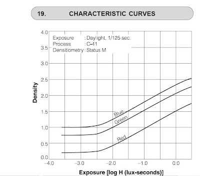
 As I mentioned before, with film determining exposure was a reasonably straight forward affair (although still seems to have and continue to mystify many).
Essentially you just used a tool to measure your film density and you could understand from that if you were under exposing or not.
The graph here is the density for negative film.
Of course you needed to measure this, and before we had digital tools this may have been tricky. But since the mid 1990's this has been easier as Scanners as it happens make good and simple densitometers.
With Slides however its much easier, you just look at it. If it looks dark you got it under exposed and if its washed out then you over exposed it.
If it wasn't for the fact that slides were notoriously difficult to get prints from I reckon more and more people would have used slides. As an aside here I'll mention that while slides look like the sorts of thing that is projected at the movies, the cinema industry actually uses negative to shoot with and the "prints" are what you see on the projectors. Cunning.
An important point is that the quantization of analog data from the sensor is not the same as the absolute values that the sensor is producing. Unlike film, where density is determined by light levels (up to a saturation point) the Analog to Digital Converter (ADC) is tuned by the camera maker to match the sensor (pixel) output. So while we have numbers we don't really know what they correspond to without making known source measurements. More bits is better up to a point, but after that only if more bits means greater ranges of analog readings.
Well, anyway ... I know how digital cameras record their data on the sensor, which I covered in that previously mentioned article on exposure:
The RAW data is the Linear Distribution, mapping that to an image is where the Gamma Corrected Distribution comes in.
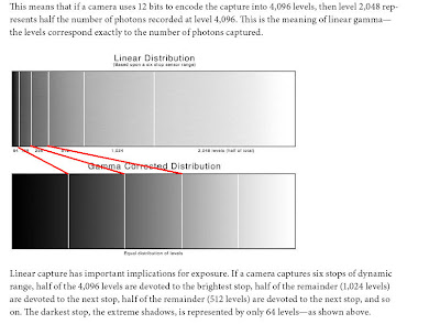
Of course you don't have to map it according to that, and many don't. Although maybe most cameras do, that's changing with makers addressing tone mapping concepts in camera.
Well, anyway before I get carried away, lets get back to analysis of my images.
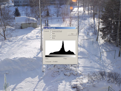
Below is the data set from the image which looked like this
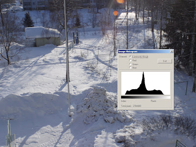
now, look at that histogram and there is no data in the very black and no data in the very white. Suggesting no blow outs. Now look at this data table below. Data seems to start from about the 27th level in the count...
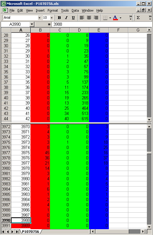
and sort of run out at about step 3988. Remember this is greater than 8 bit data and as it happens these data levels fit within a 12 bit range (binary value 111110010101 if you wanted to know)
Looking carefully you can see that data representing high levels is trickling to a standstill as we approach 3988. Now, lets look at the next image in my bracketed sequence
which is just showing clipping, but interestingly still has a gap where nothing is really black. Looking at the data from that image we see that indeed low level data starts a little later ...
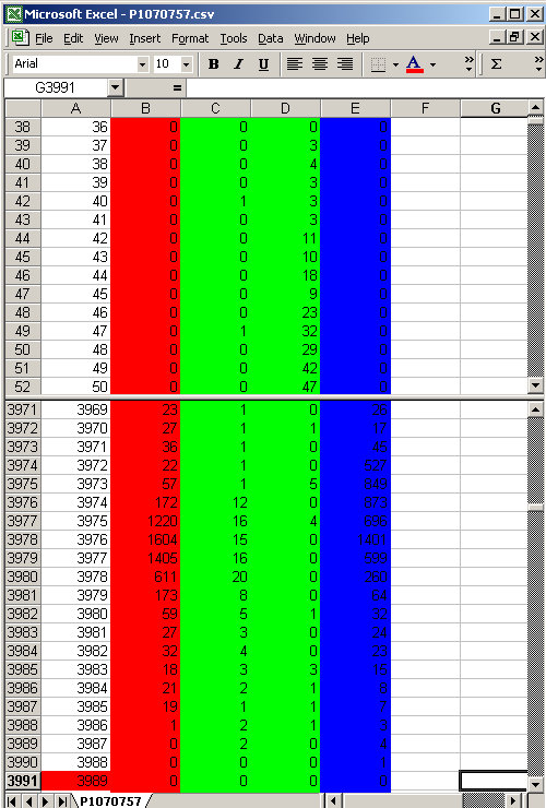
we are starting to see a little clustering happening around 3972 level ... The bunches of data show more and more levels are approaching the clipping point.
But its funny to me, its almost like its being scrunched together before it hits the mathematical limit. This starts to look like some sort of compression algorithm is being applied to it before the analog signal gets digitized. This sort of signal processing is actually common in the Audio industry, even before digital we used 8 to 1 or 10 to 1 compression leading into the more ugly infinity to 1 compression (limiting) to prevent tape saturation.
Lets look at the camera generated JPG image where we have really obvious clipping
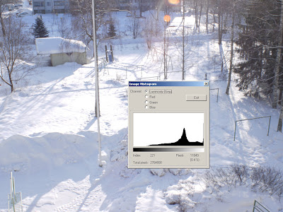
and a slightly extended area of no data, looking at the data from that RAW image the data doesn't start appearing until about level 120 (although note that green is well under way there)

and we have the same bulb of numbers appearing at the end and a soft fall into a hard limit of 3989 again.
So to me it seems that the hard limit is 3989, and nothing goes over that (or reaches it) and that as data approaches it it gets scrunched up in a bundle rather than just clipped with a smack.
The data for this is available here for those who are interested to see the data.
Because I am not able (yet) to look at the actual raw data, I am employing dcraw (which is the most reliable source I know for converting RAW, and is used by dozens of software vendors to make their products work) to decode this and then using another tool to explore that, I can not be certain this is not an artifact of dcraw. What I do know however is that this is not confined to my Panasonic G1.
Here is a sample from my 10D, a much older camera, and one from the generation where people really do talk about "hard clipping".

we see a few things of interest in this dataset:
- the data starts much later, with nothing before 128 (a significant number in digital)
- all the data channels start much earlier
- the two green channels are not equal at their cut off point and the blue cuts off earlier(perhaps making ugly images at that point).
- it goes a wee bit higher in the range than the Panasonic
- what seems to be low level truncation of data in the 10D results in the reputation for "clean files" that the Canon has;
- if the ugly high lights of the Canon are related to the scaling of data;
- if the ugly noise seen in the Panasonic when tonemapping is related to the gentle trail in of data at the start
- if all this means that we can just use camera JPGs more on the newer cameras, not needing to rely on tricks and tools to get better images?
- are we loosing real data by not compressing more effectively, perhaps cameras doing log encoding of the data in the first place would get us away from some of the noise (you know, optics have flare and stuff ... we don't all do astrophotography) in the system and have better access to the high count (bright light) data.
... just as long as you get the capture right in the first place.
stay tuned for more as I find it out.
PS I thought that incase anyone had not thought about this, I'd take this time to demonstrate what a histogram is. If you remember this image from my previous post...
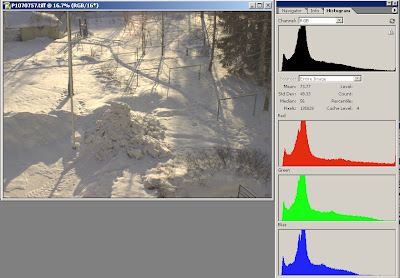
well if we take the data from that spread sheet and in Excel plot a graph averaging its values over the range it covers, we get this.
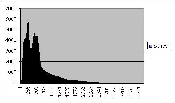
so now you perhaps see your histogram in a better light ;-)


1 comment:
One nag: can you change the text colour in the blue columns to yellow or white? Next to impossible to read black on blue.
Post a Comment